
The Trailer: The Most Important First Impression
The trailer is the first thing every visitor encounters. At this moment the player knows almost nothing about your project. If the opening is slow, dark or lacking in meaningful action, you lose them immediately.
A strong Steam page starts with a trailer that communicates the core experience within three seconds. This can be a hit, a jump, a threat, a signature movement pattern or a distinctive art style. The viewer should instantly understand what type of game they are looking at, without relying on text or narration.
Screenshots: Proof That Confirms the Promise
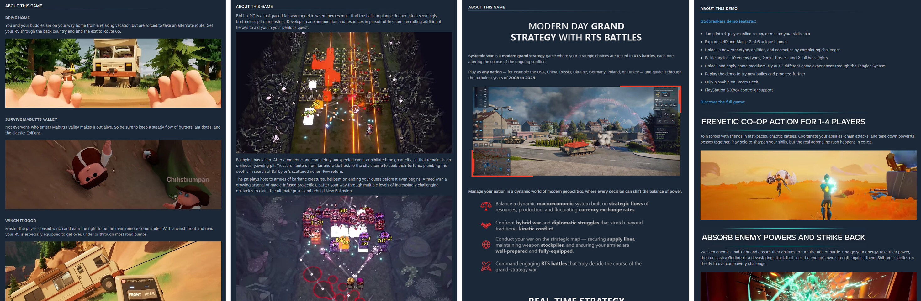
After the trailer, attention shifts to the screenshots. Their role is to validate the expectations set by the capsule and the first seconds of the video. Good screenshots show clear gameplay moments, readable scenes, strong angles and recognizable mechanics.
A frequent mistake is showcasing staged or overly polished shots that do not reflect the moment to moment experience of the game. Players want proof and clarity. They want to understand how the game actually feels. Screenshots are short visual answers to those questions.

The Description: Clear, Honest Text That Builds Trust
The description is one of the most underestimated conversion elements on a Steam page. Players read it when visuals have successfully captured their attention. But long blocks of text, vague statements and generic marketing language quickly break that interest.
A high converting description explains three things with clarity:
• What the game is
• What emotions it delivers
• What the player actually does moment to moment
Avoid hiding weaknesses. Players recognize honesty and reward it. If the game is hardcore, say it. If it is narrative driven, say it. If it has survival elements, be open about them. Clarity increases conversion. Ambiguity kills it.
How Players Move Through the Page
Understanding user flow is essential:
• They watch the trailer
• They check the screenshots
• They scroll down
• They read the description
• They sometimes return to the top
During this journey they constantly compare what they are seeing to what they expected. When something does not align, they leave. When everything matches across the page, they wishlist. A strong page minimizes mismatch moments and maintains a consistent, readable message at every step.
The Damage of Mismatch Between Trailer and Screenshots
One of the biggest reasons players bounce is a disconnect between what the trailer promises and what the screenshots deliver. Examples include:
• A dynamic trailer paired with static or empty screenshots
• A horror tone in the video but bright, adventure like stills
• A polished cinematic opening followed by screenshots that look outdated
When the page speaks with two voices, conversion collapses. Every element must communicate the same tone, genre and emotional message.
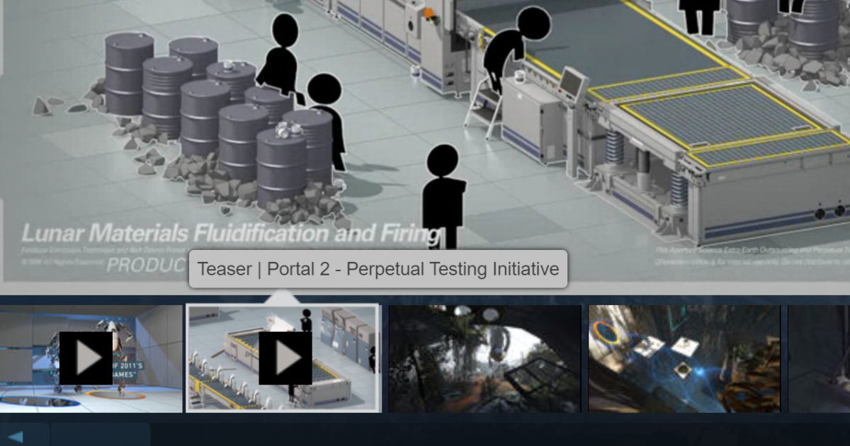
Visual Clarity: Avoiding Outdated or Overloaded Graphics
Players do not demand cutting edge graphics. They demand readability. Screenshots should be clear, recent and free of heavy UI clutter, text overlays or low contrast environments.
The same applies to trailers. Heavy interface panels, long pans, slow transitions or static moments push viewers away. The page should feel dynamic even when the player is standing still. Every frame should move them forward.
Image: Overloaded UI example next to a clean, readable frame
Roadmap and Updates: Building Confidence Without Overpromising
Players want to know the game is alive. A short, specific and well structured roadmap builds trust. But it must stay grounded. Overpromising destroys credibility faster than anything else.
A strong roadmap reinforces confidence. A weak one raises doubts about whether the project will be supported long term.
The First Five Seconds Decide Everything
Every element influences wishlist conversion, but the impact is not equal. The strongest drivers are the first five seconds on the page:
• The trailer
• The first two screenshots
• The top portion of the description
If these pieces work well, the player continues exploring. If they fail, the tab closes. This is not a flaw in the game. It is a packaging problem.
The Steam Page as the Foundation of Your Entire Launch Strategy
A Steam page is not a mix of images and text. It is a structured system built to capture attention and convert it into meaningful interest. A well crafted page helps the player understand the game within thirty seconds. It communicates what they do, what makes the game unique, how it looks, what emotions it evokes and why it deserves a wishlist.
A weak page signals uncertainty and pushes users away.
When your Steam page performs well, every traffic source becomes more effective. When the page is weak, even exceptional marketing cannot compensate for the losses. Building a strong Steam page early is one of the highest leverage actions you can take. The stronger the page, the cheaper every new player becomes.
